The Static Site Guide • Chapter 4
Styling Elements With CSS
We built a static website using HTML in the previous chapter, but it’s not very attractive, and we can’t improve the appearance much with our current skill set. We’d quickly run into limitations if we tried to modify our content’s presentation right now. For instance, changing the font and size of the text or creating consistent spacing and layouts using only HTML tags would require outdated approaches that modern web development has largely abandoned.
We’ll need to use Cascading Style Sheets (CSS) to make changes like that. CSS is a language that controls the presentation of content, allowing you to modify every aspect of how elements appear on a web page.
Think of CSS as a layer that sits on top of your HTML. The HTML file contains the content for your web page, while the CSS file contains the presentation instructions. By using CSS, we can keep the content and presentation logically separated.
CSS is as large a topic as HTML, but we can start small and implement some basic styles now. Let’s take a look at how it works.
Creating a CSS File
The first step is creating a new file to hold our CSS. Before we do that, let’s update our directory structure by creating a new css directory in assets. This directory will contain the main.css file. Here’s what our directory structure will look like now:
my-family
├── 404.html
├── contact.html
├── index.html
├── assets
|   ├── css
|   |   └── main.css
|   └── images
|       ├── balloons.jpg
|       ├── family-portrait.jpg
|       └── matt.png
└── family-members
    └── matt.html
Like HTML files, CSS files are plain text that you can create and edit with any text editor. And like HTML files, the extension (.css) of CSS files is important.
If you haven’t already created the css directory and the main.css file, do that now. We’ll add styles to center our headings with elegant borders, change the font to something more readable, and center images with rounded corners.
Copy and paste the following code into main.css and save the changes:
body {
    font-family: "Helvetica";
    font-size: 18px;
    line-height: 1.4;
}

h1 {
    text-align: center;
    border-bottom: 1px solid #b4b4b4;
}

img {
    display: block;
    margin-left: auto;
    margin-right: auto;
    width: 75%;
    border-radius: 10%;
    border: 1px solid #555;
}
This is a basic example, but it gives you a taste of what CSS is capable of. We’re using three CSS rules to style HTML elements with element selectors that directly match an HTML element name. For example, h1 is an element selector that matches the h1 HTML heading element in our HTML file.
Each line inside a CSS rule defines a CSS property and its value. For example, font-family: "Helvetica" sets the font-family property to Helvetica, while text-align: center sets the text-align property to center. CSS properties control specific aspects of how elements appear. There are properties for colors, fonts, spacing, borders, and much more. The property name comes first, followed by a colon, then the value you want to set, and finally a semicolon to end the declaration.
How will this CSS change the way our website looks? Without looking in our web browser, we can guess by examining the styles. For example, we’re specifying that the h1 elements should be center-aligned with a border underneath them. And since font-related styles for body will be inherited by most elements within it, we’re effectively changing the font and the size of all the text.
Applying the CSS to Our Website
Now we need to connect the main.css file to our index.html file so that the CSS loads with our homepage. We can use the <link> tag to tell the browser to load and apply our CSS file. Add the following line to index.html in between the <head> tags:
<link rel="stylesheet" href="assets/css/main.css">
Now the code for our index.html looks like this:
<!DOCTYPE html>
<html lang="en">
<head>
<meta charset="utf-8">
<meta name="viewport" content="width=device-width">
<title>The Cone Family Website</title>
<link rel="stylesheet" href="assets/css/main.css">
</head>
<body>
<h1>The Cone Family Website</h1>
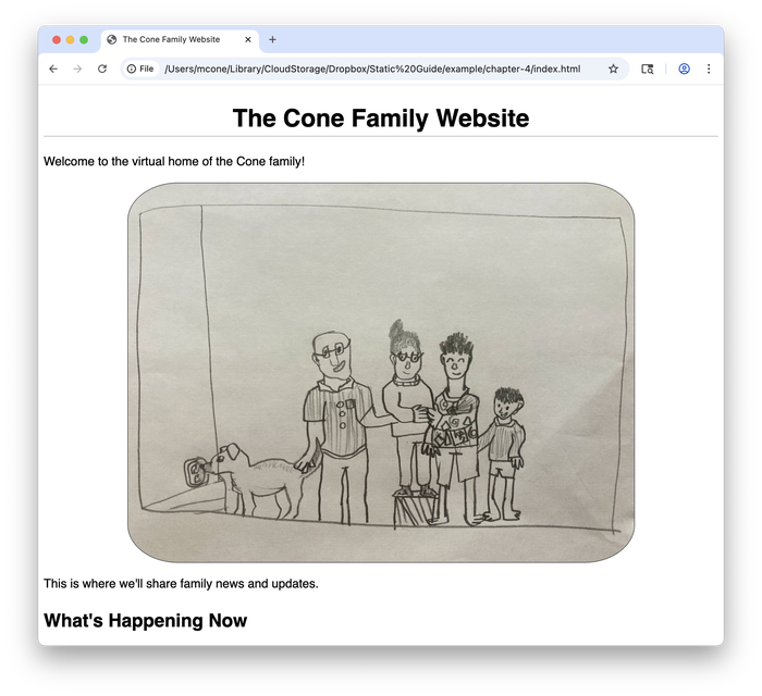
<p>Welcome to the virtual home of the Cone family!</p>
<!-- Don't forget to update this image with our holiday photo in December -->
<img src="assets/images/family-portrait.jpg" width="600" alt="Finn's drawing of our family">
<p>This is where we'll share family news and updates.</p>
<h2>What's Happening Now</h2>
<p>Matt recently launched <a href="https://www.staticguide.org"><em>The Static Site Guide</em></a>.</p>
<h2>Meet the Family</h2>
<ul>
<li><strong>Reem:</strong> The long-suffering bedrock of the family</li>
<li><strong><a href="family-members/matt.html">Matt</a>:</strong> Mildly obsessed with computer Dad jokes</li>
<li><strong>Finn:</strong> Teenager probably spray-painting something as you read this</li>
<li><strong>Simon:</strong> Resident expert on Lego Star Wars mini-figures</li>
<li><strong>Cleo:</strong> Cow dog who's afraid of cows ¯\_(ツ)_/¯</li>
</ul>
</body>
</html>
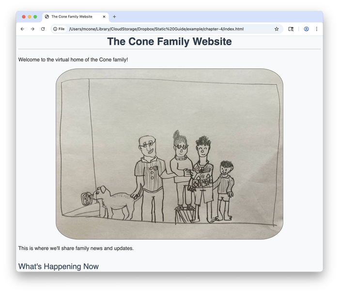
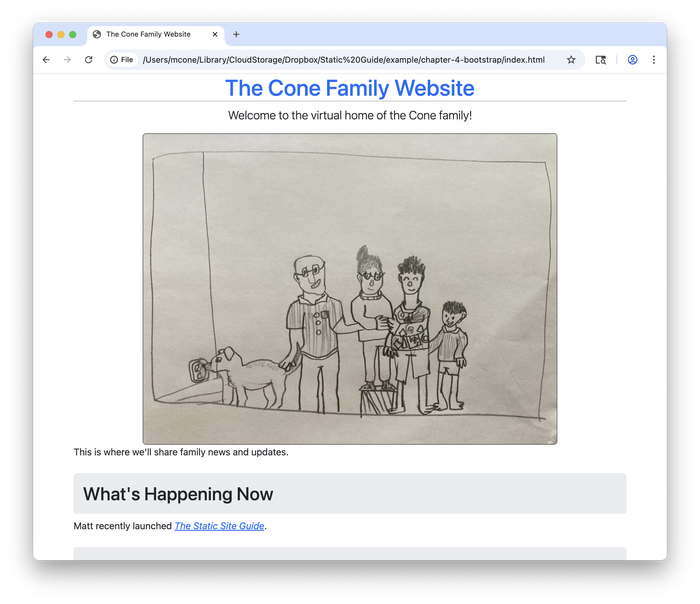
Save the changes to index.html and refresh the page in your web browser to see the results. The CSS has improved the presentation of our web page, as shown below.
We changed the look and feel of our web page without even touching the HTML!
main.css to index.html, but you still need to add the <link rel="stylesheet" href="assets/css/main.css"> line to the <head> section of all your other HTML pages. Try doing that now.Exploring CSS Properties
Now that you’ve applied CSS to your website, let’s experiment with some common CSS properties. These will give you a better feel for what’s possible and help you understand what’s happening behind the scenes.
We’ll add these properties one at a time so you can see how each one changes the appearance of your website. Each property we explore is fundamental to how modern websites are styled.
Adding Color
Changing colors is one of the easiest ways to transform the look of your website. The background-color and color properties let you set the color of any element, from the entire page to individual paragraphs.
Let’s add a subtle background color to our page and change the color of the text. Update your main.css file with the following code:
body {
    font-family: "Helvetica";
    font-size: 18px;
    line-height: 1.4;
    background-color: #f8f9fa;
    color: #333;
}

h1 {
    text-align: center;
    border-bottom: 1px solid #b4b4b4;
}

img {
    display: block;
    margin-left: auto;
    margin-right: auto;
    width: 75%;
    border-radius: 10%;
    border: 1px solid #555;
}
Save the file and refresh the web page in your web browser. Notice how the page now has a light gray background instead of pure white? It’s shown below.

The #f8f9fa color code creates a subtle off-white background that’s easier on the eyes. We’ve also changed the text color to #333, which is a dark gray that provides better contrast against the new background.
Controlling Font Weight
The font-weight property controls how bold or light your text appears. This is useful when creating visual hierarchy and making certain elements stand out without changing their size or color.
Add the following font-weight properties to your CSS:
body {
    font-family: "Helvetica";
    font-size: 18px;
    line-height: 1.4;
    background-color: #f8f9fa;
    color: #333;
}

h1 {
    text-align: center;
    border-bottom: 1px solid #b4b4b4;
    font-weight: bold;
    color: #2c3e50;
}

h2 {
    color: #34495e;
    font-weight: normal;
    margin-top: 2rem;
}

img {
    display: block;
    margin-left: auto;
    margin-right: auto;
    width: 75%;
    border-radius: 10%;
    border: 1px solid #555;
}
Save the changes, refresh the web page in your browser, and you’ll see that the main heading now appears bolder and more prominent while the subheadings have a lighter, more refined appearance, as shown below.
The different font weights help guide readers through the content.
Understanding Spacing
Two of the most important properties are padding and margin, which control spacing around elements. Padding adds space inside an element, between the content and the element’s border. Margin adds space outside an element, pushing it away from other elements. Let’s see how these work by adding some margin to our h2 elements:
body {
    font-family: "Helvetica";
    font-size: 18px;
    line-height: 1.4;
    background-color: #f8f9fa;
    color: #333;
}

h1 {
    text-align: center;
    border-bottom: 1px solid #b4b4b4;
    font-weight: bold;
    color: #2c3e50;
}

h2 {
    color: #34495e;
    font-weight: normal;
    margin-top: 2rem;
    background-color: #e9ecef;
    padding: 1rem;
    border-radius: 5px;
}

img {
    display: block;
    margin-left: auto;
    margin-right: auto;
    width: 75%;
    border-radius: 10%;
    border: 1px solid #555;
}
Save the changes and refresh the web page in your browser. Notice how the h2 headings now have a light gray background with space around the text, as shown below?
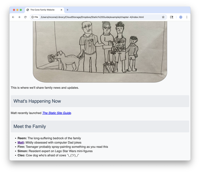
The padding: 1rem creates breathing room inside each heading, while margin-top: 2rem pushes the headings away from the content above them. The border-radius rounds the corners for a modern appearance. These spacing properties work together to create visual separation and improve readability.
rem unit stands for “root em” and is relative to the font size of the root element (usually 16 pixels in most web browsers). So 1rem equals 16 pixels, 2rem equals 32 pixels, and so on. Using rem instead of fixed pixel values makes your spacing scale nicely with different font sizes and screen types.Using Classes
Now that you understand CSS properties, let’s learn about a powerful feature that lets you apply styles selectively. Sometimes you’ll want to style one element differently from others of the same type. For example, you might want to make one paragraph stand out as an introduction while keeping other paragraphs styled normally.
This is where CSS classes come in. A class is a way to label HTML elements so you can target them specifically with CSS. You add a class to an HTML element using the class attribute, like this:
<p class="intro">Welcome to the virtual home of the Cone family!</p>
To target the intro class in CSS, create a selector that starts with a dot followed by the class name:
.intro {
    font-size: 20px;
    font-weight: bold;
    color: #2c3e50;
}
intro) we’re using here is arbitrary. In a real-world situation, you could use descriptive words or phrases that explain the purpose of the styling, like highlight or call-to-action.These styles will only be applied to HTML elements that use the intro class. You could apply this class to a heading, a list item, or any other HTML element to give it the same styling. Let’s see how this works. Update the index.html file with the following code:
<!DOCTYPE html>
<html lang="en">
    <head>
        <meta charset="utf-8">
        <meta name="viewport" content="width=device-width">
        <title>The Cone Family Website</title>
        <link rel="stylesheet" href="assets/css/main.css">
    </head>
    <body>
        <h1>The Cone Family Website</h1>
        <p class="intro">Welcome to the virtual home of the Cone family!</p>
        <!-- Don't forget to update this image with our holiday photo in December -->
        <img src="assets/images/family-portrait.jpg" width="600" alt="Finn's drawing of our family">
        <p>This is where we'll share family news and updates.</p>

        <h2>What's Happening Now</h2>
        <p>Matt recently launched <a href="https://www.staticguide.org"><em>The Static Site Guide</em></a>.</p>

        <h2>Meet the Family</h2>
        <ul>
          <li><strong>Reem:</strong> The long-suffering bedrock of the family</li>
          <li><strong><a href="family-members/matt.html">Matt</a>:</strong> Mildly obsessed with computer Dad jokes</li>
          <li><strong>Finn:</strong> Teenager probably spray-painting something as you read this</li>
          <li><strong>Simon:</strong> Resident expert on Lego Star Wars mini-figures</li>
          <li><strong>Cleo:</strong> Cow dog who's afraid of cows ¯\_(ツ)_/¯</li>
        </ul>
    </body>
</html>
And then update the main.css file with the following code:
body {
    font-family: "Helvetica";
    font-size: 18px;
    line-height: 1.4;
    background-color: #f8f9fa;
    color: #333;
}

h1 {
    text-align: center;
    border-bottom: 1px solid #b4b4b4;
    font-weight: bold;
    color: #2c3e50;
}

h2 {
    color: #34495e;
    font-weight: normal;
    margin-top: 2rem;
    background-color: #e9ecef;
    padding: 1rem;
    border-radius: 5px;
}

img {
    display: block;
    margin-left: auto;
    margin-right: auto;
    width: 75%;
    border-radius: 10%;
    border: 1px solid #555;
}

.intro {
    font-size: 20px;
    font-weight: bold;
    color: #2c3e50;
}
Save both files and refresh the web page in your browser. The first paragraph now appears larger, bolder, and in a different color, making it stand out as an introduction to the page, as shown below.
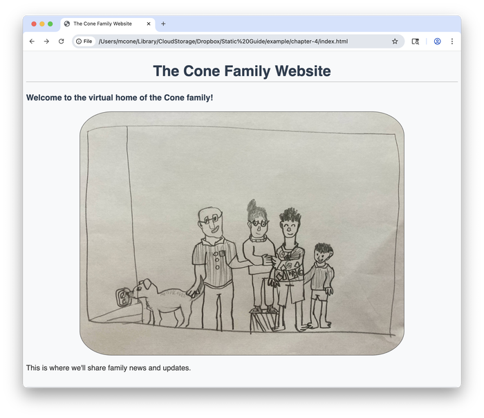
The class selector gave us precise control over which paragraph to style without affecting the others.
Other Ways of Using CSS
Hopefully you’ve gotten a feel for what’s possible with CSS. It’s a powerful way to change how your website looks. At this point, you might be wondering: should I write all my CSS from scratch, or is there an easier way? The answer depends on what you’re trying to accomplish.
Custom CSS—what we’ve been creating in this chapter—is great when you want complete control over every aspect of your design. It allows you to style a small website and create a unique look that sets it apart from others. Of course, it also helps you learn CSS by practicing at your own pace.
CSS frameworks exist because developers got tired of writing the same basic styles over and over again—things like navigation bars, buttons, and responsive layouts. By using a CSS framework, we can take advantage of hundreds of pre-built styles and components that other people have created and shared—for free.
Writing custom CSS is like cooking from scratch. You have complete control over the ingredients and techniques, but it takes more time and skill. Using a CSS framework is like using a high-quality meal kit. You get professional results quickly, but with some limitations on customization.
To be clear, you don’t have to use a CSS framework—custom CSS alone can take you a long way. But to show you how CSS frameworks work, we’ll use one for the rest of this chapter.
Using the Bootstrap CSS Framework
Bootstrap is one of the most widely-used CSS frameworks, and it provides a complete design system with pre-built components. It’s free to use, easy to install, and simple to configure.
Installing the Framework
Before we completely rebuild our page, let’s see how Bootstrap can improve our existing website with just a few small changes. We’ll add Bootstrap classes gradually so you can see how each one affects the appearance.
First, let’s add the Bootstrap link to our current index.html file. Add this line to the <head> section, right after your existing CSS link:
<!DOCTYPE html>
<html lang="en">
    <head>
        <meta charset="utf-8">
        <meta name="viewport" content="width=device-width">
        <title>The Cone Family Website</title>
        <link rel="stylesheet" href="assets/css/main.css">
        <link href="https://cdn.jsdelivr.net/npm/bootstrap@5.3.7/dist/css/bootstrap.min.css" rel="stylesheet" integrity="sha384-LN+7fdVzj6u52u30Kp6M/trliBMCMKTyK833zpbD+pXdCLuTusPj697FH4R/5mcr" crossorigin="anonymous">
    </head>
    <body>
        <h1>The Cone Family Website</h1>
        <p class="intro">Welcome to the virtual home of the Cone family!</p>
        <!-- Don't forget to update this image with our holiday photo in December -->
        <img src="assets/images/family-portrait.jpg" width="600" alt="Finn's drawing of our family">
        <p>This is where we'll share family news and updates.</p>

        <h2>What's Happening Now</h2>
        <p>Matt recently launched <a href="https://www.staticguide.org"><em>The Static Site Guide</em></a>.</p>

        <h2>Meet the Family</h2>
        <ul>
          <li><strong>Reem:</strong> The long-suffering bedrock of the family</li>
          <li><strong><a href="family-members/matt.html">Matt</a>:</strong> Mildly obsessed with computer Dad jokes</li>
          <li><strong>Finn:</strong> Teenager probably spray-painting something as you read this</li>
          <li><strong>Simon:</strong> Resident expert on Lego Star Wars mini-figures</li>
          <li><strong>Cleo:</strong> Cow dog who's afraid of cows ¯\_(ツ)_/¯</li>
        </ul>
    </body>
</html>
Save the changes and refresh the web page in your browser. You might notice the font looks slightly different—that’s Bootstrap’s default typography taking effect! Now let’s add some simple Bootstrap classes to see the magic happen.
Adjusting the Typography and Layout
Bootstrap provides utility classes that can instantly improve your page’s appearance. Let’s add a few strategic classes to our existing HTML:
<!DOCTYPE html>
<html lang="en">
    <head>
        <meta charset="utf-8">
        <meta name="viewport" content="width=device-width">
        <title>The Cone Family Website</title>
        <link rel="stylesheet" href="assets/css/main.css">
        <link href="https://cdn.jsdelivr.net/npm/bootstrap@5.3.7/dist/css/bootstrap.min.css" rel="stylesheet" integrity="sha384-LN+7fdVzj6u52u30Kp6M/trliBMCMKTyK833zpbD+pXdCLuTusPj697FH4R/5mcr" crossorigin="anonymous">
    </head>
    <body class="container">
        <h1 class="text-center text-primary">The Cone Family Website</h1>
        <p class="lead text-center">Welcome to the virtual home of the Cone family!</p>
        <!-- Don't forget to update this image with our holiday photo in December -->
        <img src="assets/images/family-portrait.jpg" class="img-fluid rounded mx-auto d-block" alt="Finn's drawing of our family">
        <p>This is where we'll share family news and updates.</p>

        <h2 class="mt-4">What's Happening Now</h2>
        <p>Matt recently launched <a href="https://www.staticguide.org"><em>The Static Site Guide</em></a>.</p>

        <h2 class="mt-4">Meet the Family</h2>
        <ul>
          <li><strong>Reem:</strong> The long-suffering bedrock of the family</li>
          <li><strong><a href="family-members/matt.html">Matt</a>:</strong> Mildly obsessed with computer Dad jokes</li>
          <li><strong>Finn:</strong> Teenager probably spray-painting something as you read this</li>
          <li><strong>Simon:</strong> Resident expert on Lego Star Wars mini-figures</li>
          <li><strong>Cleo:</strong> Cow dog who's afraid of cows ¯\_(ツ)_/¯</li>
        </ul>
    </body>
</html>
Save and refresh—notice the dramatic improvement, as shown below.
Here’s what each Bootstrap class does:
| Bootstrap Class | Description |
|---|---|
container | Centers the content and adds responsive margins. |
text-center | Centers the text. |
text-primary | Colors the heading with Bootstrap’s primary blue. |
lead | Makes the paragraph larger and more prominent. |
img-fluid | Makes the image responsive. |
rounded | Adds rounded corners to the image. |
mx-auto d-block | Centers the image. |
mt-4 | Adds top margin for better spacing. |
Adding Components
Now let’s see how Bootstrap components can make our content even more engaging. We’ll add some buttons and improve the family list with Bootstrap’s card component:
<!DOCTYPE html>
<html lang="en">
    <head>
        <meta charset="utf-8">
        <meta name="viewport" content="width=device-width">
        <title>The Cone Family Website</title>
        <link rel="stylesheet" href="assets/css/main.css">
        <link href="https://cdn.jsdelivr.net/npm/bootstrap@5.3.7/dist/css/bootstrap.min.css" rel="stylesheet" integrity="sha384-LN+7fdVzj6u52u30Kp6M/trliBMCMKTyK833zpbD+pXdCLuTusPj697FH4R/5mcr" crossorigin="anonymous">
    </head>
    <body class="container">
        <h1 class="text-center text-primary">The Cone Family Website</h1>
        <p class="lead text-center">Welcome to the virtual home of the Cone family!</p>
        <!-- Don't forget to update this image with our holiday photo in December -->
        <img src="assets/images/family-portrait.jpg" class="img-fluid rounded mx-auto d-block" alt="Finn's drawing of our family">
        <p class="text-center">This is where we'll share family news and updates.</p>
        <div class="text-center mb-4">
            <a href="family-members/matt.html" class="btn btn-primary me-2">Meet the Family</a>
            <a href="contact.html" class="btn btn-outline-secondary">Get in Touch</a>
        </div>

        <h2 class="mt-4">What's Happening Now</h2>
        <div class="alert alert-info">
            Matt recently launched <a href="https://www.staticguide.org" class="alert-link"><em>The Static Site Guide</em></a>.
        </div>

        <h2 class="mt-4">Meet the Family</h2>
        <div class="row">
            <div class="col-md-6"><div class="card mb-3"><div class="card-body"><h5 class="card-title">Reem</h5><p class="card-text">The long-suffering bedrock of the family</p></div></div></div>
            <div class="col-md-6"><div class="card mb-3"><div class="card-body"><h5 class="card-title"><a href="family-members/matt.html" class="text-decoration-none">Matt</a></h5><p class="card-text">Mildly obsessed with computer Dad jokes</p></div></div></div>
            <div class="col-md-6"><div class="card mb-3"><div class="card-body"><h5 class="card-title">Finn</h5><p class="card-text">Teenager probably spray-painting something as you read this</p></div></div></div>
            <div class="col-md-6"><div class="card mb-3"><div class="card-body"><h5 class="card-title">Simon</h5><p class="card-text">Resident expert on Lego Star Wars mini-figures</p></div></div></div>
            <div class="col-md-6"><div class="card mb-3"><div class="card-body"><h5 class="card-title">Cleo</h5><p class="card-text">Cow dog who's afraid of cows ¯\_(ツ)_/¯</p></div></div></div>
        </div>
    </body>
</html>
Save and refresh to see the transformation. We’ve added professional-looking buttons with btn classes, an eye-catching alert box for the news section, and a responsive card layout for the family members that automatically arranges in columns, as shown below.
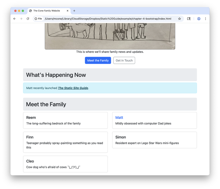
Your website now looks much more professional with relatively small changes. Hopefully you’ve seen how just a few Bootstrap classes can dramatically improve your HTML.
Implementing a Full Bootstrap Makeover
Now that you’ve seen how Bootstrap classes can enhance your existing HTML, let’s create a complete Bootstrap layout that takes full advantage of the framework’s capabilities. The following example shows how professional websites are typically structured with Bootstrap components.
Let’s create some new HTML code for our index.html file. Delete the existing code in the index.html file, copy and paste the following code into index.html, and then save the changes.
<!DOCTYPE html>
<html lang="en">
<head>
<meta charset="utf-8">
<meta name="viewport" content="width=device-width, initial-scale=1">
<title>The Cone Family Website</title>
<link href="https://cdn.jsdelivr.net/npm/bootstrap@5.3.7/dist/css/bootstrap.min.css" rel="stylesheet" integrity="sha384-LN+7fdVzj6u52u30Kp6M/trliBMCMKTyK833zpbD+pXdCLuTusPj697FH4R/5mcr" crossorigin="anonymous">
</head>
<body>
<!-- Navigation -->
<div class="container">
<header class="d-flex flex-wrap justify-content-center py-3 mb-4 border-bottom">
<a href="/" class="d-flex align-items-center mb-3 mb-md-0 me-md-auto text-dark text-decoration-none">
<span class="fs-4 fw-bold">The Cone Family</span>
</a>
<ul class="nav nav-pills">
<li class="nav-item"><a href="index.html" class="nav-link active" aria-current="page">Home</a></li>
<li class="nav-item"><a href="contact.html" class="nav-link">Contact</a></li>
</ul>
</header>
</div>
<!-- Hero Section with Image -->
<div class="container-fluid bg-light py-5">
<div class="container">
<div class="row align-items-center">
<div class="col-md-6">
<h1 class="display-4 fw-bold text-primary">Welcome Home!</h1>
<p class="lead">You've found the virtual home of the Cone family.</p>
<p class="text-muted">This is where we'll share family news and updates.</p>
<div class="d-grid gap-2 d-md-flex">
<a href="family-members/matt.html" class="btn btn-primary btn-lg">Meet the Family</a>
<a href="contact.html" class="btn btn-outline-secondary btn-lg">Get in Touch</a>
</div>
</div>
<div class="col-md-6 text-center">
<!-- Don't forget to update this image with our holiday photo in December -->
<img src="assets/images/family-portrait.jpg" class="img-fluid rounded shadow-lg" alt="Finn's drawing of our family" style="max-height: 400px;">
</div>
</div>
</div>
</div>
<!-- What's Happening Section -->
<div class="container my-5">
<div class="row">
<div class="col-lg-8 mx-auto">
<div class="card border-0 shadow-sm">
<div class="card-body p-4">
<h2 class="card-title h3 text-center mb-4">What's Happening Now</h2>
<div class="alert alert-info" role="alert">
<i class="bi bi-info-circle"></i>
Matt recently launched <a href="https://www.staticguide.org" class="alert-link"><em>The Static Site Guide</em></a>.
</div>
</div>
</div>
</div>
</div>
</div>
<!-- Meet the Family Section -->
<div class="container mb-5">
<div class="row">
<div class="col-lg-10 mx-auto">
<h2 class="text-center mb-4">Meet the Family</h2>
<div class="row g-3">
<div class="col-md-6">
<div class="card h-100">
<div class="card-body">
<h5 class="card-title">Reem</h5>
<p class="card-text">The long-suffering bedrock of the family</p>
</div>
</div>
</div>
<div class="col-md-6">
<div class="card h-100 border-primary">
<div class="card-body">
<h5 class="card-title">
<a href="family-members/matt.html" class="text-decoration-none">Matt</a>
</h5>
<p class="card-text">Mildly obsessed with computer Dad jokes</p>
</div>
</div>
</div>
<div class="col-md-4">
<div class="card h-100">
<div class="card-body">
<h5 class="card-title">Finn</h5>
<p class="card-text">Teenager probably spray-painting something as you read this</p>
</div>
</div>
</div>
<div class="col-md-4">
<div class="card h-100">
<div class="card-body">
<h5 class="card-title">Simon</h5>
<p class="card-text">Resident expert on Lego Star Wars mini-figures</p>
</div>
</div>
</div>
<div class="col-md-4">
<div class="card h-100">
<div class="card-body">
<h5 class="card-title">Cleo</h5>
<p class="card-text">Cow dog who's afraid of cows ¯\_(ツ)_/¯</p>
</div>
</div>
</div>
</div>
</div>
</div>
</div>
<!-- Footer -->
<footer class="bg-dark text-light py-4 mt-5">
<div class="container text-center">
<p class="mb-0">© 2025 The Cone Family. Made with ❤️ and Bootstrap.</p>
</div>
</footer>
</body>
</html>
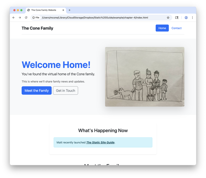
Yes, this wall of code looks daunting. But don’t panic—you’ve got this! The lines in this file contain elements you’ve seen before: HTML tags, CSS classes, and text.
Let’s take a look at how the page looks now. Save index.html if you haven’t already done so, and then refresh the page in your web browser. The new web page is shown below.
Bootstrap has great documentation and examples. If you feel like it, take a break to explore what’s possible with Bootstrap and try adding some other components to your web page.
An Aside on Embracing Curiosity
Whew! Give yourself a pat on the back. You’ve done a lot of work to get to this point.
Let’s pause for a moment to talk about the importance of curiosity. When learning HTML and CSS, it helps to stay curious and keep moving forward, even when you don’t fully understand what’s in front of you. I recommend embracing curiosity with dogged determination. Don’t get too bogged down in the details—keep going.
It’s easy to get frustrated and overwhelmed by code samples like the one you saw in the previous section. There might even come a time when you consider throwing in the towel. But before you do, I want to let you in on a couple of secrets.
First, I want to reassure you that not everyone understands this the first time they see it. If you’re not comprehending this material, don’t worry—you’re not alone. Think of it like learning a musical instrument. Nobody expects to sound like Miles Davis the first time they pick up a trumpet. But with practice, hard work, and help from others, anyone can gain competency and, with time, mastery. It’s the same with web development.
Second, you should know that most web developers, even experienced ones, borrow a lot of code. You’ve probably heard the saying “good artists copy; great artists steal.” It’s true when it comes to web development, too.
Take the code sample from the previous section, for example. Very few people write code like that completely by hand. To create that code, I did what most web designers do: I visited the page on Bootstrap’s website with the list of examples, viewed the source code, and copied the bits and pieces of code I wanted to use. At that point, it was trivial to start experimenting and modifying the code to make it do what I wanted it to do.
You can do the same thing. This is how most people learn web development. They take existing bits of code and modify them, even if they don’t initially understand what the code is doing. You already have all of the knowledge you need to do this.
The truth is that even the “experts” don’t fully understand all of this stuff. That’s where documentation and forums like Stack Overflow and Reddit come in. Millions of people read Bootstrap’s documentation every month. My guess is that the vast majority of those visitors are experienced web developers who need a refresher on how a component works.
When you’re just getting started with web development, you should build your understanding by copying code from other websites and tinkering with it. Understanding comes through repetition and practice. Code that looks confusing today will start to make sense as you encounter the same patterns again and again. If you don’t understand something, just keep going! You can always google the parts you don’t understand.
Publishing the Updates
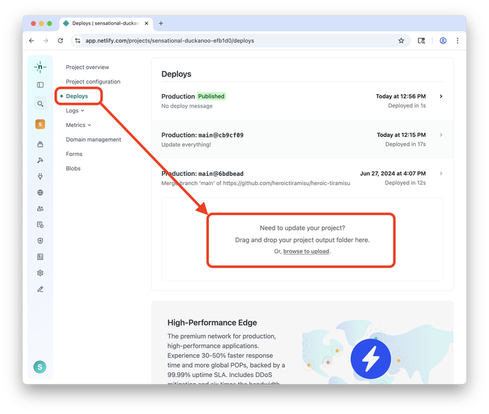
To publish the updates on our public website, we’ll go back to Netlify and drag and drop our website’s folder onto Netlify’s website. You can do this by logging in to Netlify, clicking the Deploys link, and then dragging your website folder onto the box in the middle of the page, as shown below.
After Netlify uploads your website, type in your domain name to see the changes. Your updates have been published on the internet!
Next Steps
We’ve barely scratched the surface of what’s possible with CSS. But in keeping with the goal of this book, which is to teach you how to build a static website from scratch by presenting practical information you can put to use immediately, we need to move on. There’s a lot more to cover!
I encourage you to continue experimenting with CSS on your own. A good next step would be following along with the CSS basics guide on the MDN Web Docs website. Then you can return to your website and add new elements to your source code.
Remember, you already have all the information you need to continue learning and building. Embrace curiosity with dogged determination. The sky’s the limit!